What Are Descriptive Statistics? (Definition)
Descriptive statistics are methods used to summarize, organize, and describe the main features of a dataset. They turn raw numbers into clear, interpretable insights about center, spread, and shape — without making predictions or drawing conclusions beyond the data itself.
Unlike inferential statistics, which use sample data to generalize about a larger population, descriptive statistics only describe what you already have in front of you. Every serious data analysis begins here.
Descriptive statistics do not predict the future or test hypotheses. They describe the present dataset clearly so better decisions and deeper analyses can follow.
🔑 Key Takeaways
The most important ideas in descriptive statistics at a glance.
Descriptive statistics summarize data. They turn raw numbers into clear, usable insights using measures of center, spread, and shape.
There are three main types. Central tendency, dispersion, and distribution shape — each answers a different question about your data.
Mean and median together reveal skew. When they diverge significantly, your data is skewed and the median is the better "typical" value.
Outliers distort the mean but not the median. Always check both and use IQR to detect extreme values.
Exploratory data analysis (EDA) starts here. Before any modeling or hypothesis testing, descriptive statistics reveal patterns, outliers, and data quality issues.
Types of Descriptive Statistics
Descriptive statistics are grouped into three main types. Each type answers a different question about your data, and a thorough analysis uses all three together.
| Type | Question It Answers | Key Measures |
|---|---|---|
| Central Tendency | Where does the data cluster? | Mean, Median, Mode |
| Dispersion | How spread out is the data? | Range, Variance, Standard Deviation, IQR |
| Distribution Shape | What does the pattern look like? | Skewness, Kurtosis, Percentiles |
You can also distinguish descriptive statistics by the number of variables analyzed. Univariate analysis describes one variable at a time (e.g., the mean salary in a company). Bivariate analysis describes the relationship between two variables (e.g., salary vs. years of experience), using tools like correlation and cross-tabulation. When more than two variables are involved, it is called multivariate analysis.
How to Think About Any Dataset
- 1. Where is the center? Use mean, median, or mode to find the typical value.
- 2. How spread out is the data? Use standard deviation or IQR to measure variability.
- 3. What does the shape look like? Use skewness and kurtosis to understand distribution patterns.
- 4. Are there outliers? Use the 1.5×IQR rule or a box plot to flag extreme values.
Why Descriptive Statistics Matter
Raw data rarely tells its own story. Descriptive statistics turn messy spreadsheets into something understandable. In exploratory data analysis (EDA), they help you spot outliers, check data quality, and decide which advanced methods to apply.
They also form the foundation for inferential statistics, hypothesis testing, and predictive modeling. Students, analysts, researchers, and data scientists all rely on these measures as their first step in any analysis.
Frequency Distribution
Before diving into specific measures, it helps to understand frequency distribution — how often each value (or range of values) appears in a dataset. It is typically displayed as a table or histogram.
For example, if 30 students take an exam and scores range from 60–100, a frequency distribution table might show:
| Score Range | Frequency (# of Students) | Relative Frequency |
|---|---|---|
| 60–69 | 3 | 10% |
| 70–79 | 8 | 27% |
| 80–89 | 12 | 40% |
| 90–100 | 7 | 23% |
Frequency distributions are the starting point for histograms and are especially useful for understanding the overall pattern of different types of data. You can build your own with the histogram maker.
Measures of Central Tendency
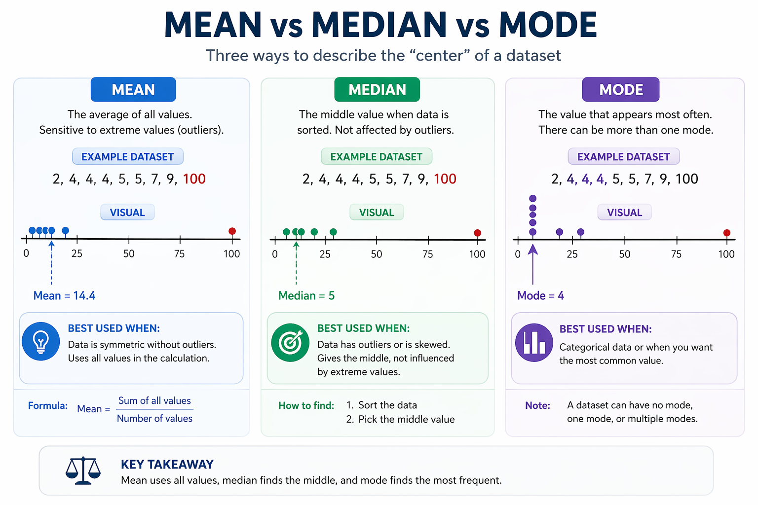
These measures show the typical or central value in a dataset. There are three, and knowing when to use each one is one of the most important skills in data analysis. See our full comparison in mean vs median vs mode.
Mean
The mean is the arithmetic average — the sum of all values divided by the count.
Formula: $ \bar{x} = \frac{\sum x_i}{n} $
Example — Exam Scores: 65, 72, 75, 78, 80, 82, 85, 88, 90, 95
Sum = 810 → $ \bar{x} = \frac{810}{10} = 81 $
The average score is 81. The mean works best when data is roughly symmetric with no extreme outliers. For more worked examples, see mean examples.
When some values count more than others (e.g., grades weighted by credit hours), use the weighted mean instead.
Median
The median is the middle value after sorting data in order. For an even number of values, it is the average of the two middle values.
Sorted scores: 65, 72, 75, 78, 80, 82, 85, 88, 90, 95
Median = (80 + 82) / 2 = 81
The power of the median shows when you add an outlier. Replace 95 with 200:
Original data: 65, 72, 75, 78, 80, 82, 85, 88, 90, 95 → Mean = 81, Median = 81
With outlier (95 → 200): 65, 72, 75, 78, 80, 82, 85, 88, 90, 200
Mean = 90.5 (moved 9.5 points) | Median = 81 (barely changed)
The mean uses every value and is pulled by extremes. The median depends only on middle position — making it more stable for skewed or outlier-heavy data.
For more worked examples, see median examples.
Mode
The mode is the most frequently occurring value. Some datasets have no mode, one mode (unimodal), two modes (bimodal), or multiple modes (multimodal).
Shoe sizes in a class: 7, 8, 8, 8, 9, 9, 10, 11 → Mode = 8
Mode is especially useful for categorical data where mean and median don't apply — such as most popular product color, most common diagnosis, or most frequent survey response.
Measures of Dispersion (Spread)
Knowing the center is useful, but two datasets can share the same mean and behave very differently. Measures of dispersion tell you how spread out the values are. We'll use the same exam dataset throughout: 65, 72, 75, 78, 80, 82, 85, 88, 90, 95.
Range
Formula: Range = Maximum − Minimum = 95 − 65 = 30
Simple and quick, but sensitive to outliers — one extreme value completely changes it.
Variance and Standard Deviation
Variance measures the average squared distance of each value from the mean.
Sample variance formula: $ s^2 = \frac{\sum (x_i - \bar{x})^2}{n-1} $
For the scores: variance ≈ 93.33
The drawback of variance is that it is in squared units (e.g., "squared points"), which is hard to interpret. Standard deviation solves this by taking the square root.
Standard deviation: $ s = \sqrt{93.33} \approx 9.66 $
A standard deviation of ~9.7 means most scores fall within about 10 points of the average. For more, see standard deviation vs variance and standard deviation examples.
Note: standard deviation is often confused with standard error. See standard deviation vs standard error for the distinction.
Interquartile Range (IQR)
The IQR focuses on the middle 50% of the data, completely ignoring the top and bottom 25%. This makes it robust to outliers.
Q1 = 75, Q3 = 88 → IQR = 88 − 75 = 13
The 1.5×IQR rule for outliers: any value below Q1 − 1.5×IQR (= 75 − 19.5 = 55.5) or above Q3 + 1.5×IQR (= 88 + 19.5 = 107.5) is flagged as a potential outlier. Learn more about identifying and handling outliers, or use the outlier detector tool.
Five-Number Summary
The five-number summary packages the key spread information into five values: minimum, Q1, median, Q3, and maximum. It is the foundation of every box plot.
- Minimum: 65
- Q1 (25th percentile): 75
- Median (Q2 / 50th percentile): 81
- Q3 (75th percentile): 88
- Maximum: 95
Try the five-number summary calculator or the five-number summary visualizer.
Which Measure Should You Use?
Choosing the right measure depends on the shape of your data and whether outliers are present. This is one of the most practical questions in data interpretation.
- Use the mean when your data is roughly symmetric and contains no extreme outliers. It uses all values and is most statistically efficient under those conditions.
- Use the median when your data is skewed or includes outliers. It gives a more reliable "typical" value. Income and home prices are classic examples.
- Use the mode when working with categorical data or when you need the most common value.
- Use standard deviation when data follows a roughly normal distribution and you want to measure variability in the original units.
- Use IQR when data contains outliers or is not normally distributed — it focuses on the middle 50% and resists extreme values.
In practice, always look at both mean and median together. A large gap between them is a strong signal that the data is skewed.
Shape of the Distribution
After understanding center and spread, look at the overall pattern. The shape tells you whether values are balanced around the center or pulled in one direction.
Skewness
Skewness describes asymmetry in a distribution. It is one of the most important signals when interpreting descriptive statistics.
| Skewness Type | What It Looks Like | Mean vs Median | Common Example |
|---|---|---|---|
| Positive (right) skew | Long tail on the right | Mean > Median | Income, house prices |
| Negative (left) skew | Long tail on the left | Mean < Median | Age at retirement, failure time |
| Symmetric (no skew) | Balanced on both sides | Mean ≈ Median | Height, IQ scores |
Example: Salaries (in thousands): 45, 48, 52, 55, 60, 65, 70, 120
Mean ≈ 64.4, Median = 57.5 → positive (right) skew. The single high salary pulls the tail and the mean to the right.
Kurtosis
Kurtosis describes how heavy the tails are relative to a normal distribution — and how peaked or flat the center is.
- Leptokurtic (high kurtosis): sharp peak, heavy tails — more extreme values than a normal distribution
- Mesokurtic (normal kurtosis ≈ 3): the standard bell curve
- Platykurtic (low kurtosis): flatter peak, lighter tails
Percentiles and Quartiles
Percentiles divide data into 100 equal parts and show where a value stands relative to the rest of the dataset. Quartiles are the key percentiles that split data into four equal parts.
- Q1 (25th percentile): 25% of values fall below this point
- Q2 (50th percentile / median): middle value of the dataset
- Q3 (75th percentile): 75% of values fall below this point
Percentiles are used everywhere: standardized test rankings, income distribution, and pediatric growth charts. A score at the 85th percentile means 85% of others scored lower.
How to Interpret Descriptive Statistics
Calculating numbers is only half the job. Knowing what those numbers are telling you is where real analysis begins. Here is a systematic approach.
Step 1: Compare Mean and Median
If mean ≈ median → the data is roughly symmetric. No major skew.
If mean > median → positive (right) skew. A few high values are pulling the average up.
If mean < median → negative (left) skew. A few low values are pulling the average down.
Step 2: Evaluate the Standard Deviation in Context
A standard deviation is "large" or "small" relative to the mean. A useful check is the coefficient of variation (CV) = (SD / Mean) × 100%. A CV below 15% usually indicates low variability; above 30% indicates high variability. See the standard deviation visualizer.
Step 3: Use the Empirical Rule for Normal Data
For roughly normal data, the empirical rule (68-95-99.7 rule) tells you that:
- ~68% of values fall within 1 standard deviation of the mean
- ~95% fall within 2 standard deviations
- ~99.7% fall within 3 standard deviations
Step 4: Flag Outliers with the IQR Rule
Calculate the lower fence (Q1 − 1.5 × IQR) and upper fence (Q3 + 1.5 × IQR). Any value outside these fences is a potential outlier. Outliers can indicate data entry errors, measurement problems, or genuinely rare events. See how to handle outliers in data analysis.
Step 5: Check the Skewness Number
- Skewness between −0.5 and +0.5 → approximately symmetric
- Skewness between ±0.5 and ±1 → moderately skewed
- Skewness beyond ±1 → highly skewed; use median and IQR instead of mean and SD
Try It Yourself
Dataset: 12, 15, 15, 18, 20, 22, 25
Work through these before checking mentally:
- What is the mean?
- What is the median?
- What is the mode?
- What is the range?
- What does the mean vs median comparison suggest about skewness?
Use the descriptive statistics calculator to verify your answers instantly.
Population vs Sample Statistics
Descriptive statistics can be computed for an entire population (every member of a group) or a sample (a subset). The distinction matters for formulas.
| Concept | Population | Sample |
|---|---|---|
| Mean symbol | μ (mu) | x̄ (x-bar) |
| Standard deviation symbol | σ (sigma) | s |
| Variance denominator | N | n − 1 (Bessel's correction) |
| When to use | You have data on everyone | You have a subset; most real-world cases |
The sample formula uses n − 1 (instead of n) to correct for the fact that samples tend to underestimate population variability. See population vs sample statistics for a full explanation.
Descriptive vs Inferential Statistics
Descriptive statistics describe the data you have. Inferential statistics use a sample to draw conclusions about a larger population — through confidence intervals, hypothesis tests, and regression.
| Aspect | Descriptive Statistics | Inferential Statistics |
|---|---|---|
| Goal | Describe what the data shows | Draw conclusions about a population |
| Focus | Current dataset | Generalization from sample |
| Requires probability theory | No | Yes |
| Typical tools | Mean, SD, IQR | Confidence intervals, hypothesis tests |
| Next steps from here | – | Hypothesis Testing, Confidence Intervals |
Visualizing Descriptive Statistics
Numbers alone can be hard to interpret. Visualizations make patterns immediately visible. The most common visual tools for descriptive statistics are:
- Histograms — show frequency distribution across value ranges. Try the histogram maker.
- Box plots — display the five-number summary and flag outliers at a glance. Try the box plot generator.
- Scatter plots — reveal relationships between two variables. Try the scatter plot maker.
- Bar charts and pie charts — summarize categorical frequency distributions.
Explore all interactive tools on the visual tools page and the data visualization guide.
Real-World Uses of Descriptive Statistics
- Business: Retail teams track average daily sales, sales variance, and customer purchase distributions to inform inventory and pricing decisions.
- Finance: Analysts calculate the mean return and standard deviation of investment portfolios to assess risk. See our guide to statistics in risk management.
- Healthcare: Hospitals monitor mean recovery times, IQR of blood pressure readings, and skewness of patient ages across conditions.
- Education: Teachers review score distributions to spot learning gaps — a high standard deviation suggests uneven understanding across the class.
- Technology: Data scientists use descriptive statistics as the first step of every machine learning workflow before feature engineering and modeling.
Full Example: Analyzing a Dataset End-to-End
Let's apply every concept above to one dataset: 10, 12, 14, 15, 15, 16, 18, 20, 22, 60
Step 1: Central Tendency
Mean = (10+12+14+15+15+16+18+20+22+60) / 10 = 20.2 — pulled upward by 60
Median = (15+16)/2 = 15.5 — more representative
Mode = 15 (only repeated value)
The gap between mean (20.2) and median (15.5) immediately signals a right skew.
Step 2: Spread
Range = 60 − 10 = 50
Q1 = 13, Q3 = 21, IQR = 8
Upper fence = 21 + 1.5×8 = 33 → value 60 is a clear outlier
SD ≈ 14.6 (inflated by the outlier)
Step 3: Shape
Positively skewed (right tail) due to 60. Skewness is strongly positive. Use median and IQR to summarize this dataset, not mean and SD.
Final Interpretation
The typical value in this dataset is around 15–16 (median and mode agree). The outlier at 60 inflates the mean to 20.2 and the standard deviation to 14.6, making both misleading. The IQR of 8 tells us the central half of the data is tightly clustered between 13 and 21. If this were real data, you would investigate the value 60 — it could be a data entry error, a rare event, or a genuinely unusual observation worth noting separately.
Summary Table: All Descriptive Statistics Measures
| Measure | Type | What It Shows | Sensitive to Outliers? | Best Used When |
|---|---|---|---|---|
| Mean | Central Tendency | Arithmetic average | Yes | Symmetric data, no outliers |
| Median | Central Tendency | Middle value | No | Skewed data or outliers present |
| Mode | Central Tendency | Most frequent value | No | Categorical data or bimodal distributions |
| Range | Dispersion | Total spread (max − min) | Yes | Quick overview only |
| Variance | Dispersion | Average squared deviation | Yes | When exact mathematical properties matter |
| Standard Deviation | Dispersion | Typical distance from mean | Yes | Normal or symmetric data |
| IQR | Dispersion | Spread of middle 50% | No | Skewed data or when outliers exist |
| Skewness | Shape | Asymmetry of distribution | Yes | Choosing between mean vs. median |
| Kurtosis | Shape | Peak height and tail weight | Yes | Assessing normality assumptions |
| Percentiles | Position | Relative standing of a value | No | Ranking, growth charts, test scores |
Conclusion
Descriptive statistics are the foundation of every meaningful data analysis. They help you quickly understand what a dataset is telling you — before you move into inference, prediction, or decision-making.
The core framework is simple: always examine center, spread, and shape together. A mean without a standard deviation is incomplete. A standard deviation without skewness can be misleading. Used together, these measures give you a complete picture.
If you remember one rule: when mean and median agree, trust the mean. When they diverge, trust the median and investigate why.
From here, explore inferential statistics to learn how descriptive summaries become the basis for testing claims and building models. Or practice with the descriptive statistics calculator.
Frequently Asked Questions
Descriptive statistics is the set of methods used to summarize, organize, and describe the main features of a dataset — including its center, spread, and shape — without making predictions or generalizations beyond that data.
The three main types are: (1) measures of central tendency (mean, median, mode); (2) measures of dispersion or spread (range, variance, standard deviation, IQR); and (3) measures of distribution shape (skewness, kurtosis, percentiles). Some frameworks also include frequency distribution as a fourth type.
Compare mean and median — a large gap signals skewness. Check standard deviation relative to the mean (coefficient of variation). Use the IQR rule to flag outliers. Look at skewness: values beyond ±1 indicate highly skewed data where the median and IQR are more appropriate than mean and SD.
Use the median when data is skewed or contains outliers. The mean uses every value and gets pulled toward extremes, while the median depends only on the middle position and stays stable. Income and property prices are textbook cases where the median is always more informative.
Descriptive statistics summarize the data you already have. Inferential statistics use a sample to make predictions or test hypotheses about a larger population. Descriptive statistics are not built on probability theory; inferential statistics are. See our full descriptive vs inferential statistics comparison.
Standard deviation is expressed in the same units as the original data, making it directly interpretable. If salaries are in dollars, the standard deviation is also in dollars. Variance uses squared dollars — a unit that has no intuitive meaning. Standard deviation is also what the empirical rule (68-95-99.7) uses directly.
Positive (right) skewness means the distribution has a longer tail on the right side. Most values cluster at the lower end with a few unusually high ones. The mean is pulled above the median. Income distributions are a classic example: most people earn modest amounts, but a small number of very high earners drag the mean upward.
Any value below Q1 − 1.5×IQR or above Q3 + 1.5×IQR is flagged as a potential outlier. This rule is used by box plots to determine where the whiskers end and where individual points are plotted separately. Values more than 3×IQR from Q1 or Q3 are considered extreme outliers.
Yes. Mode and frequency distribution are the primary tools for categorical variables. Mean and standard deviation only apply to numerical data. For a full explanation, see types of data in statistics.
Discrete data takes specific countable values (e.g., number of students). Continuous data can take any value in a range (e.g., height, temperature). Both can use mean, median, and standard deviation, but frequency distributions for continuous data use ranges (bins) rather than exact counts. See discrete vs continuous data.
Read More Articles
Mean vs Median vs Mode
When to use each measure of central tendency — with real examples and side-by-side comparisons.
Read More →Exploratory Data Analysis
How to use descriptive statistics as the first step in any data science or analytics project.
Read More →Handling Outliers in Data
How to detect, investigate, and treat outliers without distorting your analysis.
Read More →